Colour choices - how not to get lost.
When I was small, I was obsessed with a dress that my mother made for me. It was perfectly pale blue. That beautifully mellifluous greeny-blue that speaks of summer seas as much as Tuscan ceilings. It sported creamy lace ribbon and mother of pearl buttons - and was a thing of beauty.
And so, I have this happy snapshot of me in my mind. Looking down on chubby brown knees, smiling and smoothing this dress. I remember just feeling content. When I see this colour now, I am transported to simple feelings of security, nurture and happiness. It is of course one of the first colours that I made for my paint company and I always find a place for it wherever I live.
From then until now I have formed my own positive and negative associations with different colours. Some are permanently in or out, and some I dabble with. Red does not find its way into my home or on my clothing – but faded, dusky pinks I welcome.
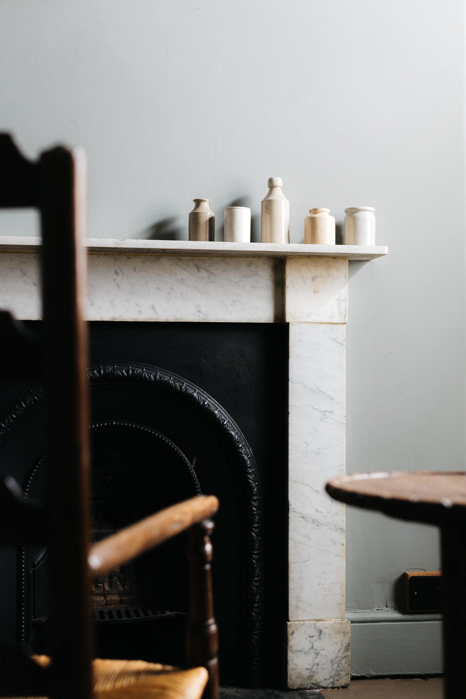
Today I like to live with very quiet colours. I enjoyed brighter hues ten years ago, but now I need it to be still. This isn’t about trends, but much more about how I want to live. And perhaps because I make colour as my career, I need a rest from it to have some clarity.
Rhythms of childhood memories, as well as marks and fragments in later life - all form our unique views on how we feel about colour. Every life choice or expectation affects what we would like to live with.
And this is how you find your personal palette.
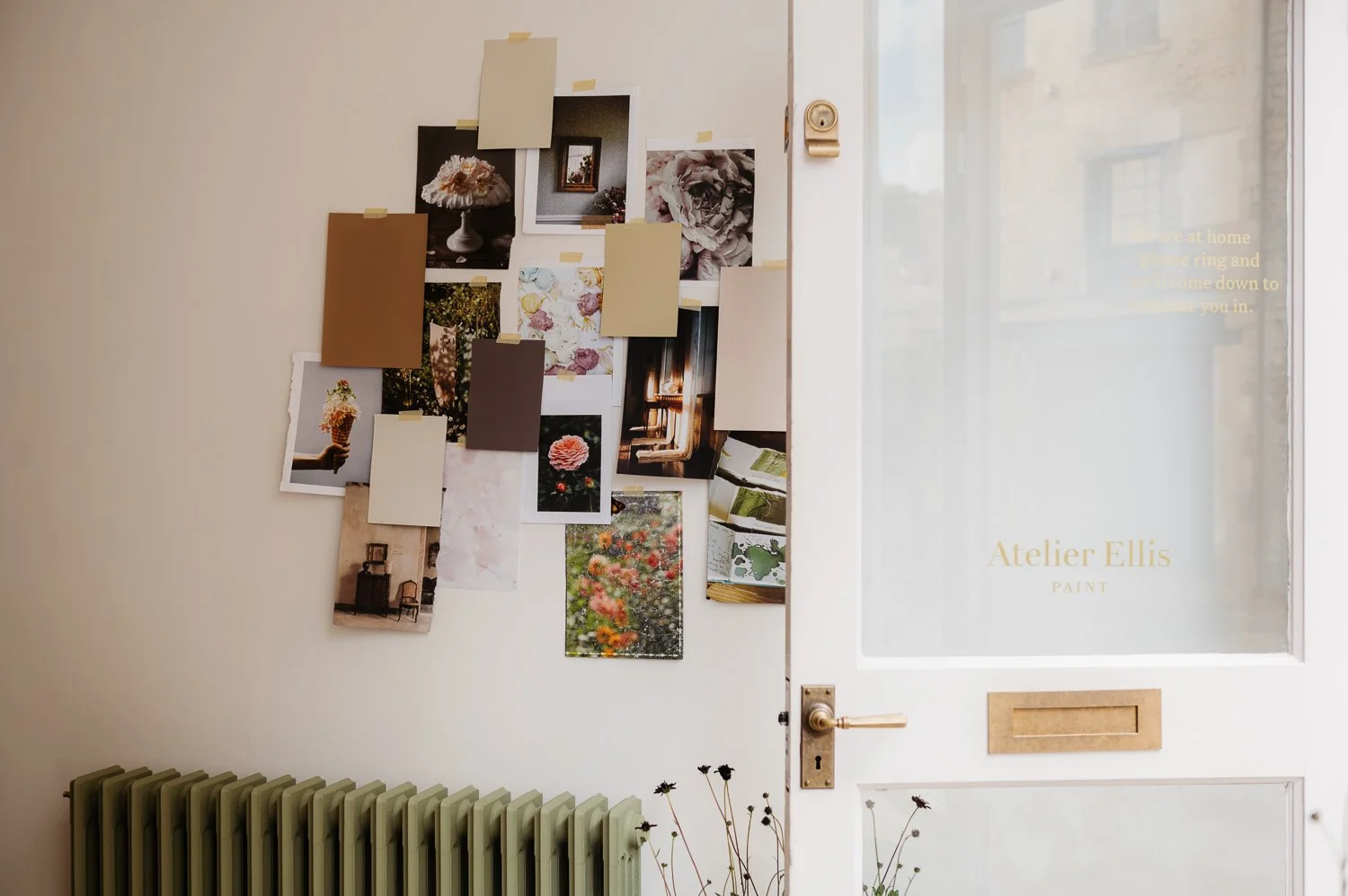
I am a big believer in the importance of making a physical mood board as an integral part of telling your story of home. When you create a tangible story, you can cast a colour hunting eye over your choices - and you will find colours and nuances that you have naturally put together. It maybe that postcards you have gathered all have the same clean and saturated subjects, or the magazine tear sheets are all reflections on white.
These touchpoints will guide you to your instinctive palette. Hold steady to this.
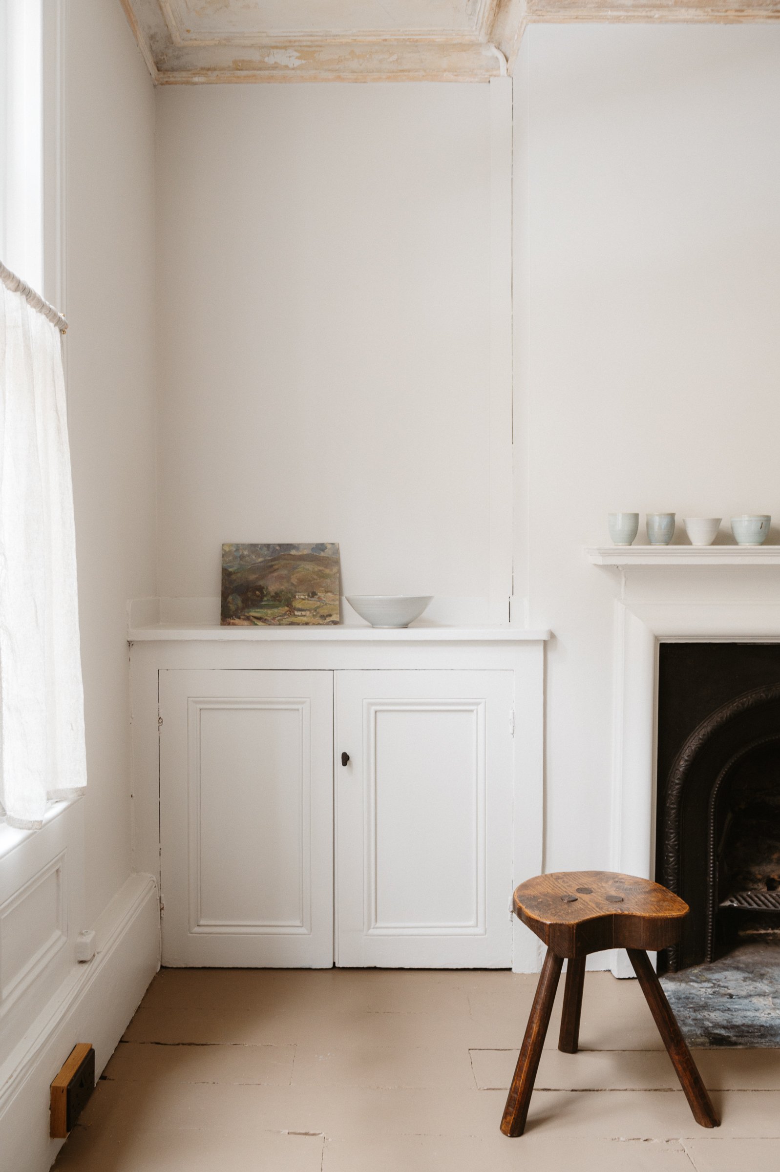
Then it’s time to find your ‘white t-shirt’ colours. The repeating colour or family of colours that would be comfortably uplifting to have at home and that form the base layer for everything else. Choosing these first makes everything much simpler to decide on. Textiles, tiles and all other colour choices can then be included or set aside easily.
When we advise on colours, we always start with our neutral families. One of these families will work for both the human and the home and it’s almost always a guttural reaction. Neutral doesn’t mean white. It could be that a family of green are the colours that link everything for you. But find one group to make all your other choices much easier.
You then use this base just like a white t-shirt. Perhaps these colours are for every ceiling or door, or every linking space.
Again – hold steady.
Then go back to that mood board and find those hues and shades that bring you joy. It then becomes this beautiful process of telling your story of home. Trends become less relevant when you know that rich yolky yellow is your happy hue or that Wedgewood blue is your colour of shelter.
Just like that you are no longer lost, but very much found.