What Colour is Home
Meditation & Conversation with
Isobel Napier
Introduction
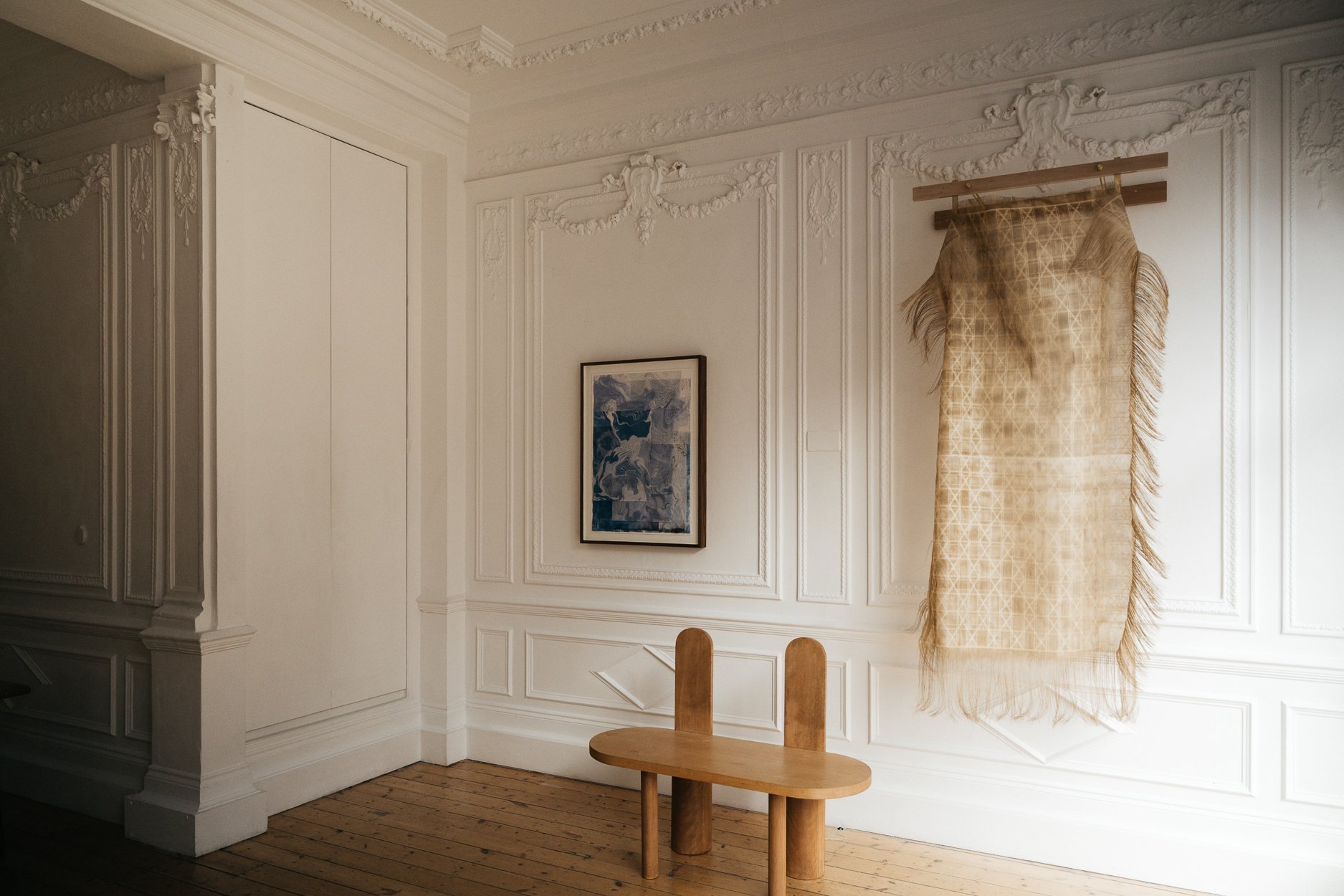
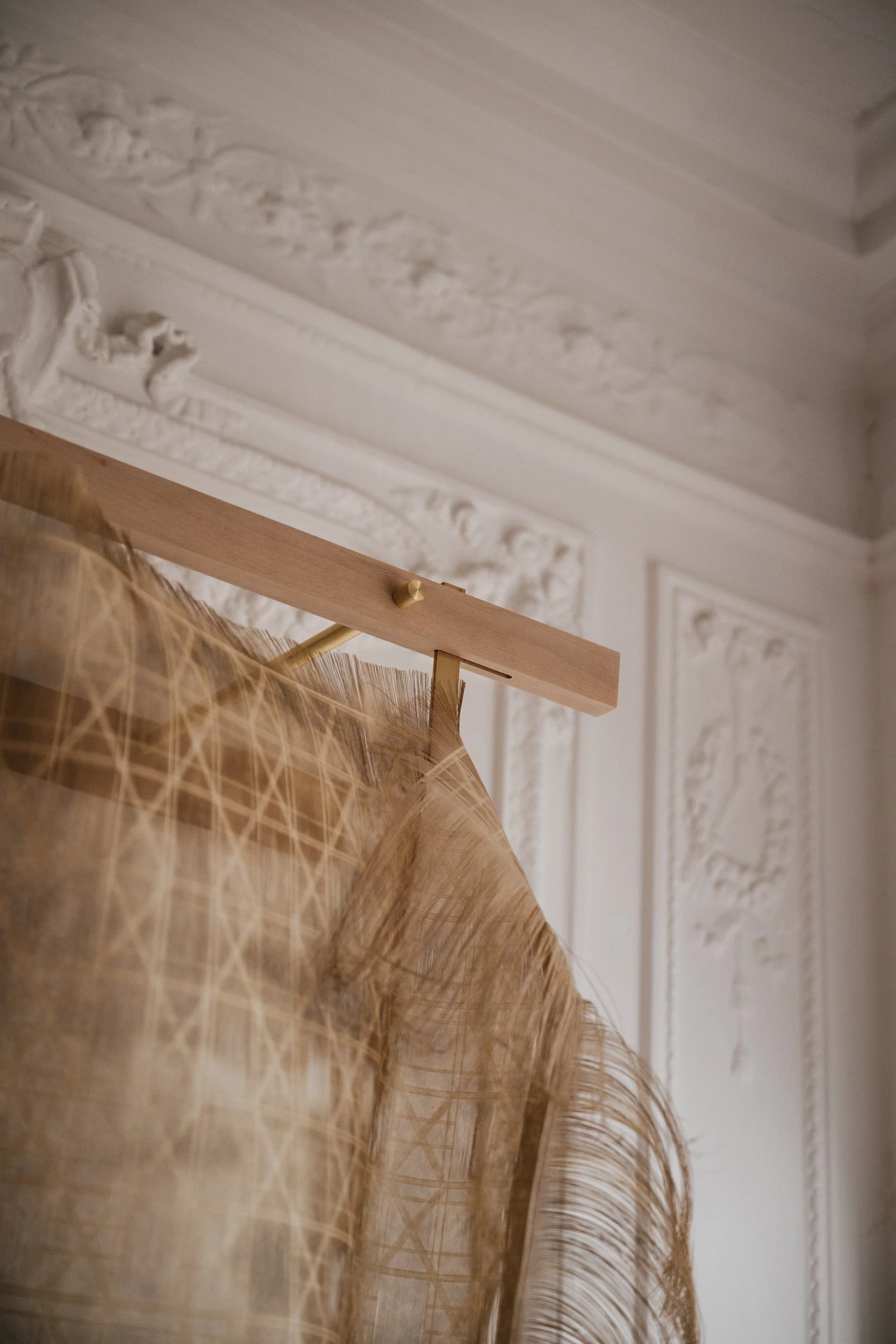
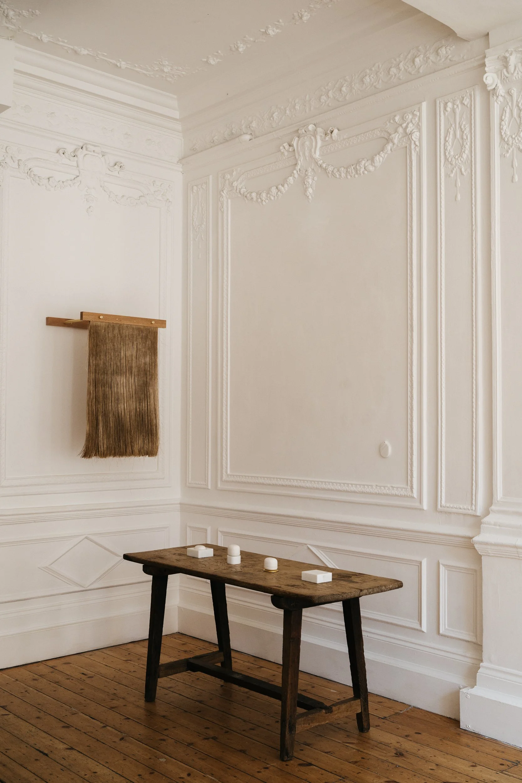
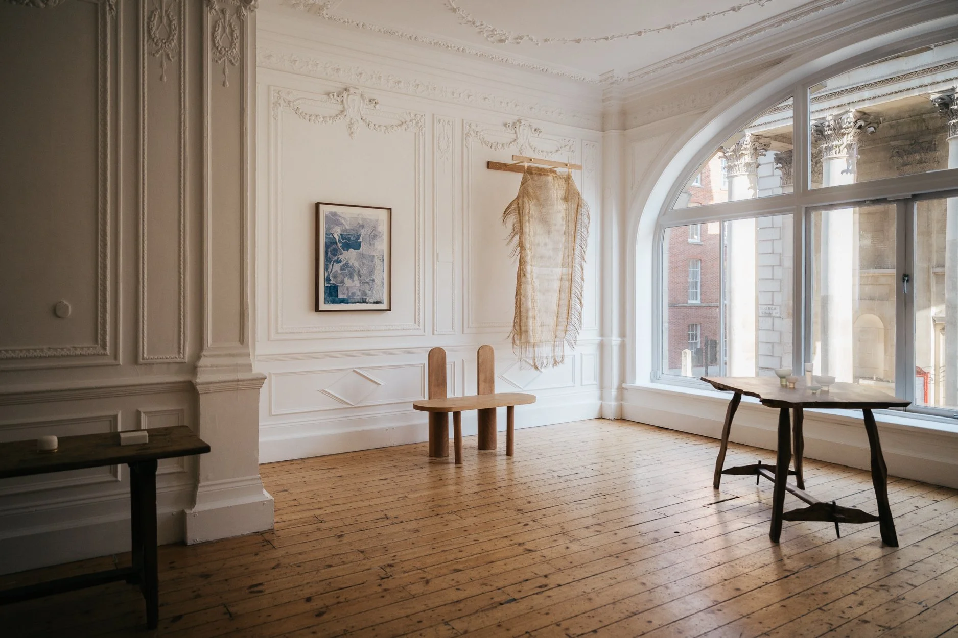
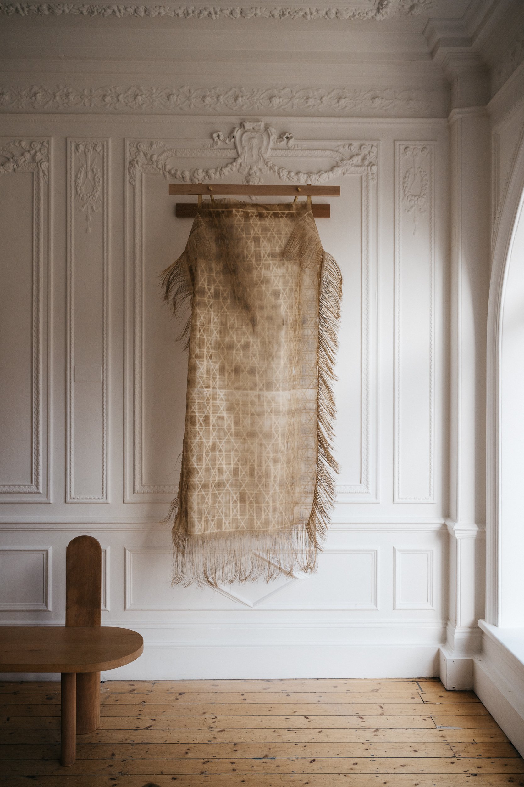
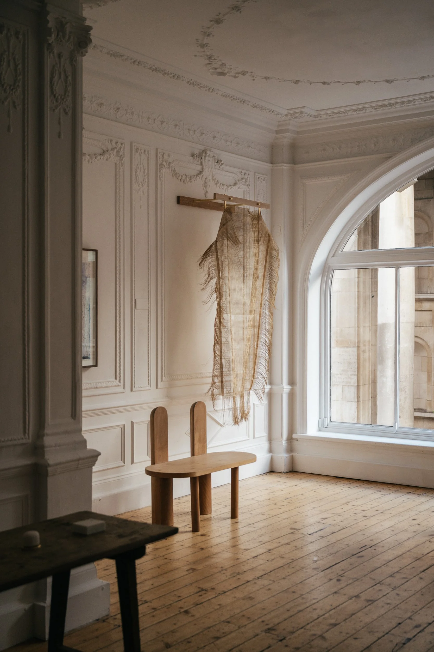
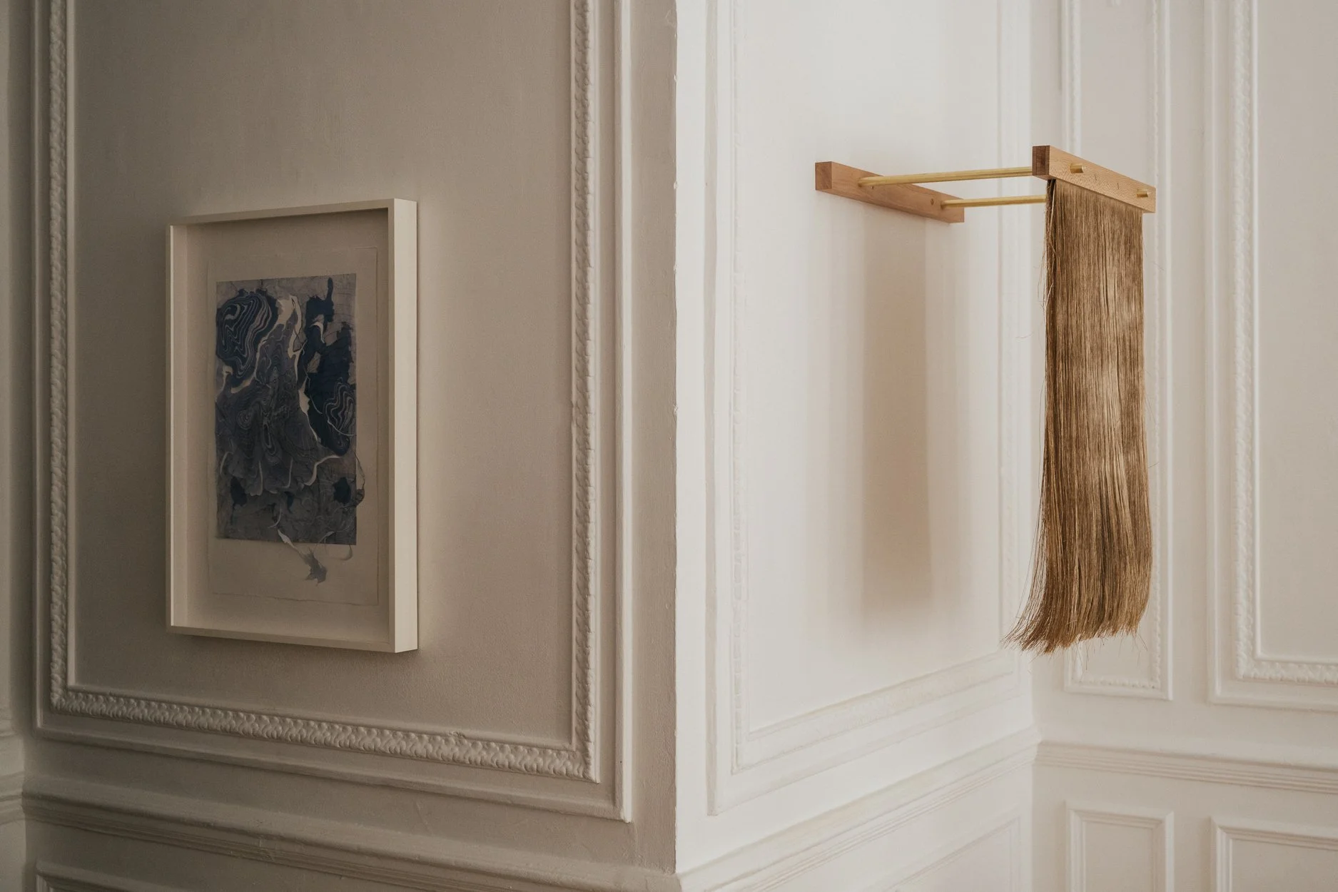
The unexpected, artist and designer Isobel Napier tells me, “is really important in my work”. Her pieces may catch you by surprise: gentle giants of intricate detailing and pattern that appear to be made of the finest silk or gossamer, but are actually paper. They could pass for precious heirlooms, linens or sheets or blankets, but as Napier explains, they offer only an illusion of such tactility. “People often want to incorporate them, particularly as a type of curtain, but they are too fragile for that.”
Similarly, Napier had never predicted that the laser-cutter would become so integral to her practice. She was trained up on the tool out of sheer practicality when assisting an older student with a project, but “loved it straight away. It was an amazing way of working, and it was similar to printmaking or to photography, because you input something that started as a digital file, and then two very physical processes that you didn't always have complete control over translated that into something else.”
Over the past decade Napier has developed her practice, from working with photography and print work in the darkrooms of The Slade at University College London, where she won the Michael Farrell Memorial Prize, to collaborating with brands including Aesop and Burberry. She also works alongside her partner, furniture maker James Trundle. The pair are currently renovating their home, something they see as a part of their combined practice, that has furthered their explorations in wood as a material to create comfort, beauty and colour.
What role does colour play in your work?
It was a really good exercise to be prompted to stop and think more about colour by this project. I had previously thought that I never really think about colour directly when I’m working. But actually, I do use colour in my work, just in a different way. While I work with the natural colours of materials, over the past few years I’ve been developing a means of trapping the smoke from the laser cutter while it cuts the paper; that impregnates it with a very warm, smoky, almost burnt hue, which, of course, is the colour. So even though I don't have so much control over exactly what colour I get, it's definitely something that I spend a lot of time trying to incorporate.
Where does your process begin?
Definitely with sketching. I love doing little drawings, even though lots of my process is digital, I always start with pen and paper before spending a lot of time on the computer, which I like, but sometimes you need to counterbalance that with doing something messy in the dark room. I have a big digital collection of patterns that I’m working on, and then that's translated by the machine. It requires a lot of testing, because you might think that a digital thing would always come out the same, like if you're printing something. But the laser cutter doesn't quite work that way, there's so much heat involved and all the nuances of the natural materials. It's an interesting balance. How things translate can vary from time to time, or with tweaks of the settings. I have layers of different papers, either above, beneath, or on both sides of the material I'm actually working on. You can see the smoke kind of seeping out where I've trapped it. And when you pull these layers away it's lovely because there's this mottled colouration where you've managed to trap it. It will always be different, and it's very unpredictable, but that's part of the pleasure as well.
Working with natural materials is one of the things that defines your collaboration with James. Tell me about what you’re working on together.
Again, we hadn’t really spoken about colour in our work until this project, but timber has so many amazing shades to it. We’re making a patchwork with timber panels, where we attach different timbers together, and it was very much about getting contrasting tones and patterns that would feel like textiles and celebrate the variety that you get even within the same species. London Plane is one of our favourite trees; when it’s first cut, the wood is this bright purple colour. It's really alarming. It looks like the tree is bleeding.
Our home is an extension of our practice; we’re in the process of renovating and we’re building everything from scratch in hard wood. The colours of it, like our work, will be lots of natural muted tones in these ochre colors. So again, while we're not getting swatch books out and choosing colours, we are in another way because we’ll have all these different timber samples and saying, “Does this go with this?”. Colour is very much playing a role.
Does a colour come to mind when you hear the word ‘home’?
I think it would be a warm ochre. I started collecting textiles because my mum was really interested in them and collected them as well. That was something we did together. She has a lot of these textiles around the house, all these lovely colours. A lot of them were these browns and oranges; those warm tones were all around us. That's what I think of.